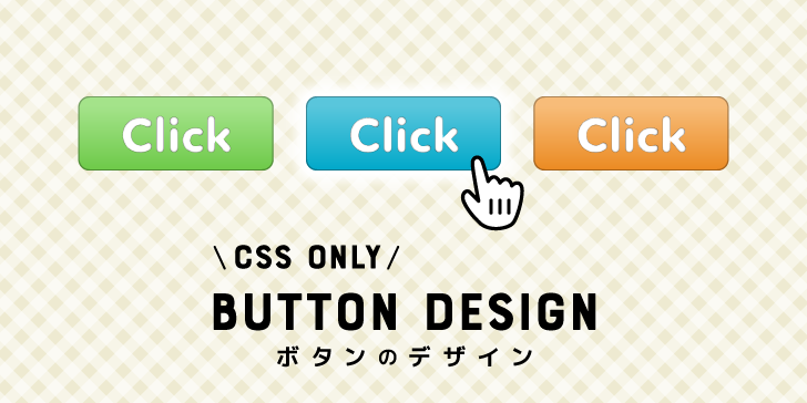
コンバージョン率にも大きく関係のあるボタンのデザイン。自分で作るとなるとCSSをたくさん書く必要があったり、書いてみても思ったようにできなかったりと大変ですよね。
そこでHTMLとCSSだけで作れるボタンのデザインのサンプルをまとめました。カーソルを合わせたあとのスタイルもクリックしたあとのスタイルもすべて用意してあるので操作感もバッチリです。そのままコピー&ペーストで使っても、大きさや色を変更してもOKです。
ボタンをCSSでデザインするための準備
まずは基本として、これから紹介するボタンのデザインがどの要素に使えるのかという説明と、CSSでスタイルをつけるにあたって事前に用意しておくと便利なリセットクラスを紹介します。
ボタンの種類
ボタンのスタイルをつけられる要素は大きく分けて以下の3つです。
1. リンク要素 ページ遷移するもの
[html]
<a href=”…”>リンク</a>
[/html]
2. ボタン要素 フォームの送信ボタンなど
[html]
<button>ボタン</button>
[/html]
3. インプット要素のtype属性がbuttonのもの (他にsubmitやresetもボタンの形状になります)
[html]
<input type=”button” value=”ボタン”>
[/html]
ボタン要素とインプット要素の違いがわかりづらいですが、HTML5から登場したボタン要素を優先して使いましょう。(少し専門的な話になりますが、インプット要素には擬似要素(::beforeと::after)を使ったスタイルが使えません。)
スタイルをリセットするクラス
思ったとおりにスタイルがつかない!ということを防ぐため、あらかじめスタイルのリセットをします。
ただし、CSSの別の場所でボタンに関わるスタイルに!importantを使っていると後にリセットや他のスタイルを追加してもそちらが優先されてしまうので注意してください。
リセットクラスを使うと以下のように、
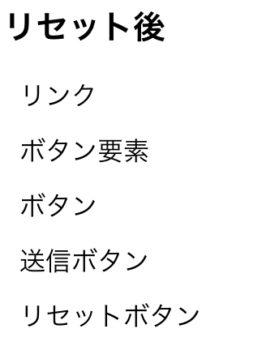
見た目は普通のテキストになります。
HTML
reset クラスで設定しました。
resetよりあとに半角スペース空けて他のクラスを書くことで上書きしてスタイルをつけることができます。
[html]
<a href=”#” class=”reset”>リンク</a>
<button class=”reset”>ボタン要素</button>
<input type=”button” class=”reset” value=”ボタン”>
<input type=”submit” class=”reset” value=”送信ボタン”>
<input type=”reset” class=”reset” value=”リセットボタン”>
[/html]
CSS
.reset としてスタイルを用意してあります。
以下のサンプルでもこのresetクラスは使用していますので、こちらもCSSにコピペしておいてください。
[css]
.reset {
color: black;
text-decoration: none;
font-family: sans-serif; /* 書体もリセットしています。不要であれば削除を */
font-weight: normal;
font-size: 16px;
line-height: 1.5;
letter-spacing: normal;
border: none;
background: transparent;
margin: 0;
padding: 0;
outline: none;
cursor: pointer;
-webkit-tap-highlight-color: rgba(0,0,0,0); /* iOSタップ時の挙動を調整 */
}
[/css]
動作サンプル
See the Pen css-button-reset by Beco (@becolomochi) on CodePen.
コピペや改変もOK!CSSを使ったボタンデザインのサンプル
フラット系のボタン
フラットデザインに合うボタンデザインです。
半透明になるボタン
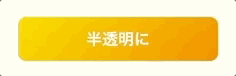
HTML
flatとfadeというクラスで設定しています。
[html]
<a href=”#” class=”reset flat fade”>半透明に</a>
[/html]
CSS
[css]
.flat.fade {
position: relative;
text-align: center;
/* 中央揃え */
display: block;
margin: 0 auto;
/* 幅の指定 */
width: 100%;
max-width: 200px;
box-sizing: border-box;
padding: 10px;
/* 色の指定 */
background: linear-gradient(135deg, #ffd900, #ff9300);
color: #fff;
font-weight: bold;
border-radius: 8px;
transition: 0.3s;
}
.flat.fade:hover {
opacity: 0.7;
}
.flat.fade:active, .flat.fade:focus {
top: 2px;
}
[/css]
地の色がつくボタン
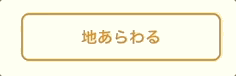
HTML
flatとborderというクラスで設定しています。
[html]
<button class=”reset flat border”>地あらわる</button>
[/html]
CSS
[css]
.flat.border {
position: relative;
text-align: center;
/* 中央揃え */
display: block;
margin: 0 auto;
/* 幅の指定 */
width: 100%;
max-width: 200px;
box-sizing: border-box;
padding: 10px;
/* 色の指定 */
background: linear-gradient(135deg, #ffd900, #ff9300);
color: #fff;
font-weight: bold;
border-radius: 8px;
transition: 0.3s;
border: 2px solid #ff9300;
background: #fff;
color: #ff9300;
}
.flat.border:hover {
background: #ff9300;
color: #fff;
}
.flat.border:active, .flat.border:focus {
top: 2px;
}
[/css]
グラデーションの向きが変わるボタン
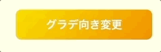
flatとinvertedというクラスで設定しています。
HTML
[html]
<input type=”button” class=”reset flat inverted” value=”グラデ向き変更”>
[/html]
CSS
[css]
.flat.inverted {
position: relative;
text-align: center;
/* 中央揃え */
display: block;
margin: 0 auto;
/* 幅の指定 */
width: 100%;
max-width: 200px;
box-sizing: border-box;
padding: 10px;
/* 色の指定 */
background: linear-gradient(135deg, #ffd900, #ff9300);
color: #fff;
font-weight: bold;
border-radius: 8px;
transition: 0.3s;
}
.flat.inverted:hover {
background: linear-gradient(-45deg, #ffd900, #ff9300);
}
.flat.inverted:active, .flat.inverted:focus {
top: 2px;
}
[/css]
ストライプが表示されるボタン
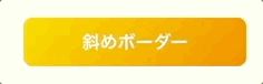
flatとborder2というクラスで設定しています。
HTML
[html]
<input type=”submit” class=”reset flat border2″ value=”斜めボーダー”>
[/html]
CSS
[css]
.flat.border2 {
position: relative;
text-align: center;
/* 中央揃え */
display: block;
margin: 0 auto;
/* 幅の指定 */
width: 100%;
max-width: 200px;
box-sizing: border-box;
padding: 10px;
/* 色の指定 */
background: linear-gradient(135deg, #ffd900, #ff9300);
color: #fff;
font-weight: bold;
border-radius: 8px;
transition: 0.3s;
}
.flat.border2:hover {
background: repeating-linear-gradient(135deg, rgba(255,255,255, 0.3), rgba(255,255,255, 0.3) 2px, transparent 2px, transparent 4px), linear-gradient(135deg, #ffd900, #ff9300);
}
.flat.border2:active, .flat.border2:focus {
top: 2px;
}
[/css]
ボタン無効のスタイル
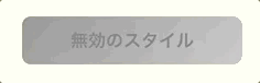
HTML側で disabled 属性が与えられたときのスタイル例です。
HTML
[html]
<input type=”reset” class=”reset flat” value=”無効のスタイル” disabled>
[/html]
CSS
[css]
.flat:disabled {
position: relative;
text-align: center;
/* 中央揃え */
display: block;
margin: 0 auto;
/* 幅の指定 */
width: 100%;
max-width: 200px;
box-sizing: border-box;
padding: 10px;
font-weight: bold;
border-radius: 8px;
background: linear-gradient(-45deg, #ccc, #999);
color: #888;
cursor: not-allowed;
}
[/css]
動作サンプル
フラット系のボタンデザインの動作を確認できます。
See the Pen css-button-flat by Beco (@becolomochi) on CodePen.
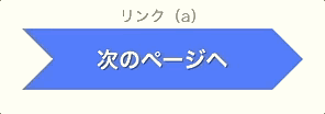
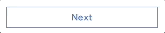
立体的なボタン
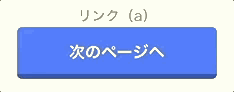
ボタン下部に暗めのラインをつけて立体的にしたデザインです。
色を変えたい場合は、ボタン地の色を変えるだけでOKです。下部のラインは黒の半透明で指定してあるので、色の組み合わせをいちいち考えずに済みます。
HTML
button-shadow というクラスで設定しています。
[html]
<a href=”#” class=”reset button-shadow”>次のページへ</a>
[/html]
CSS
[css]
.button-shadow {
text-align: center;
box-sizing: border-box;
display: block;
max-width: 200px;
width: 100%;
margin: 0 auto;
background: #447fff; /* 色変更可能 */
color: #fff;
font-weight: bold;
padding: 13px 10px 10px;
border-radius: 5px;
border-bottom: 5px solid rgba(0,0,0,0.3);
}
.button-shadow:hover {
animation: 1s flash;
}
.button-shadow:active, .button-shadow:focus {
border-bottom-width: 0;
margin-top: 5px;
background: #ff9300; /* 色変更可能 */
}
@keyframes flash {
from { opacity: 0.5; }
to { opacity: 1; }
}
[/css]
動作サンプル
立体的なボタンの動作を確認できます。
See the Pen css-button-shadow by Beco (@becolomochi) on CodePen.
背景がアニメーションするボタン
カーソルが乗ったときに背景色がアニメーションするボタンデザインです。
右から
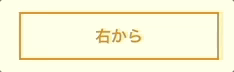
HTML
[html]
<a href=”#” class=”reset button-bg from-right”>右から</a>
[/html]
左から
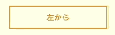
HTML
[html]
<a href=”#” class=”reset button-bg from-left”>左から</a>
[/html]
上から
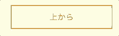
HTML
[html]
<a href=”#” class=”reset button-bg from-top”>上から</a>
[/html]
下から
HTML
[html]
<a href=”#” class=”reset button-bg from-bottom”>下から</a>
[/html]
CSS
上下左右をまとめて書いてあります。
[css]
.button-bg {
text-align: center;
box-sizing: border-box;
/* 中央揃え */
display: block;
margin: 0 auto;
/* 幅の指定 */
width: 100%;
max-width: 200px;
padding: 10px;
/* 色の指定 */
color: #ff9300; /* 文字色 */
border: 2px solid #ff9300; /* 枠線 */
font-weight: bold;
position: relative;
overflow: hidden;
}
.button-bg::after {
content: ”;
display: block;
width: 100%;
height: 100%;
background: #ff9300; /* 背景色 */
position: absolute;
top: 0;
left: 0;
z-index: -1;
transition: transform 0.2s;
}
.button-bg.from-left::after {
transform: translate(-100%);
}
.button-bg.from-right::after {
transform: translate(200%);
}
.button-bg.from-top::after {
transform: translate(0, -100%);
}
.button-bg.from-bottom::after {
transform: translate(0, 200%);
}
.button-bg:hover {
color: #fff;
}
.button-bg:hover::after {
transform: translate(0);
}
.button-bg:active, .button-bg:focus {
top: 2px;
}
[/css]
動作サンプル
背景のアニメーションを確認できます。
See the Pen css-button-bg by Beco (@becolomochi) on CodePen.
矢印風のボタン
ボタンの形状で次に進めることが直感的にわかるデザインです。
デザインの都合上、長いテキストだと表示が崩れるのでご注意ください。
HTML
button-arrow というクラスで設定しています。
[html]
<a href=”#” class=”reset button-arrow”>次のページへ</a>
[/html]
CSS
背景色は複数箇所に設定しているので色を変えたいときはまとめて直してください。
[css]
.button-arrow {
text-align: center;
box-sizing: border-box;
display: block;
background: #447fff; /* 背景色 */
color: #fff;
font-weight: bold;
font-size: 20px;
padding: 18px;
line-height: 1;
text-shadow: 1px 1px rgba(0,0,0,0.4);
max-width: 200px;
width: 100%;
margin: 0 auto;
position: relative;
top: 0;
}
.button-arrow::before, .button-arrow::after {
content: ”;
box-sizing: border-box;
border: 28px solid transparent;
width: 56px;
height: 56px;
display: block;
position: absolute;
top: 0;
}
.button-arrow::before {
border-top-color: #447fff; /* 背景色 */
border-bottom-color: #447fff; /* 背景色 */
left: -28px;
}
.button-arrow::after {
border-left-color: #447fff; /* 背景色 */
right: -56px;
}
.button-arrow:hover {
top: 1px;
opacity: 0.8;
}
.button-arrow:active, .button-arrow:focus {
background: #ff9300; /* クリックしたあとの色 */
text-shadow: 0 0 0;
}
.button-arrow:active::before, .button-arrow:focus::before {
border-top-color: #ff9300; /* クリックしたあとの色 */
border-bottom-color: #ff9300; /* クリックしたあとの色 */
}
.button-arrow:active::after, .button-arrow:focus::after {
border-left-color: #ff9300; /* クリックしたあとの色 */
}
[/css]
動作サンプル
矢印風のボタンの動作を確認できます。
See the Pen css-button-arrow by Beco (@becolomochi) on CodePen.
右側に矢印が表示されるボタン
ボタン右側にCSSで作った矢印を表示してあるボタンです。
hoverすると矢印が動くボタン
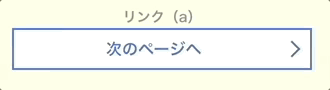
HTML
button-arrow-inner というクラスで設定しています。
[html]
<a href=”#” class=”reset button-arrow-inner”>次のページへ</a>
[/html]
CSS
複数行でも矢印の位置がズレません。
[css]
.button-arrow-inner {
text-align: center;
box-sizing: border-box;
display: block;
border: 2px solid #447fff;
background: #fff;
color: #447fff;
font-weight: bold;
padding: 0.5em 2em 0.5em 1em;
line-height: 1.4;
max-width: 300px;
width: 100%;
margin: 0 auto;
position: relative;
}
.button-arrow-inner::after {
content: ”;
width: 10px;
height: 10px;
display: block;
position: absolute;
top: 50%;
right: 12px;
margin-top: -6px;
transform: rotate(45deg);
border-top: 2px solid #447fff;
border-right: 2px solid #447fff;
transition: right 0.3s;
}
.button-arrow-inner:hover {
background: #447fff;
color: #fff;
}
.button-arrow-inner:hover::after {
border-color: #fff;
right: 7px;
}
.button-arrow-inner:active, .button-arrow-inner:focus {
opacity: 0.8;
}
[/css]
hoverしたときに細い矢印があらわれるボタン
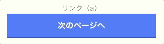
HTML
button-arrow-inner-thin というクラスで設定しています。
[html]
<a href=”#” class=”reset button-arrow-inner-thin”>次のページへ</a>
[/html]
CSS
複数行でも矢印の位置がズレません。
[css]
.button-arrow-inner-thin {
text-align: center;
box-sizing: border-box;
display: block;
background: #447fff;
border-bottom: 2px solid rgba(0,0,0,0.3);
color: #fff;
font-weight: bold;
padding: 0.8em;
line-height: 1.4;
max-width: 300px;
width: 100%;
margin: 0 auto;
position: relative;
}
.button-arrow-inner-thin::after, .button-arrow-inner-thin::before {
content: ”;
display: block;
position: absolute;
top: 50%;
right: 12px;
opacity: 0;
transition: opacity 0.3s, transform 0.3s;
}
.button-arrow-inner-thin::after {
width: 10px;
height: 10px;
margin-top: -5px;
transform: translate(-300px) rotate(45deg);
border-top: 1px solid #fff;
}
.button-arrow-inner-thin::before {
width: 40px;
height: 1px;
margin-right: -2px;
background: #fff;
transform: translate(-300px);
}
.button-arrow-inner-thin:hover::after, .button-arrow-inner-thin:hover::before {
opacity: 1;
}
.button-arrow-inner-thin:hover::after {
transform: translate(0) rotate(45deg);
}
.button-arrow-inner-thin:hover::before {
transform: translate(0);
}
.button-arrow-inner-thin:active, .button-arrow-inner-thin:focus {
opacity: 0.8;
border-bottom-color: transparent;
}
[/css]
動作サンプル
右側に矢印のあるボタンのサンプルです。
See the Pen css-button-arrow by Beco (@becolomochi) on CodePen.
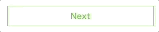
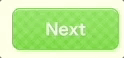
矢印があらわれて背景色が変わるボタン
矢印の形状をしながら左から右に背景が変わっていくボタンです。
HTML
5色あります。
button-bg-arrow というクラスの後に color2 〜 color5 を追加してください。
[html]
<a href=”#” class=”reset button-bg-arrow”>Next</a><!– 青 –>
<a href=”#” class=”reset button-bg-arrow color2″>Next</a><!– 緑 –>
<a href=”#” class=”reset button-bg-arrow color3″>Next</a><!– ピンク –>
<a href=”#” class=”reset button-bg-arrow color4″>Next</a><!– オレンジ –>
<a href=”#” class=”reset button-bg-arrow color5″>Next</a><!– 赤 –>
[/html]
CSS
[css]
.button-bg-arrow {
text-align: center;
box-sizing: border-box;
/* overflow: hiddenにより上下位置にズレが生じるのでdisplay: blockのみ対応可 */
overflow: hidden;
display: block;
width: 300px;
margin: 30px auto;
/* その他スタイル */
position: relative;
color: #447fff;
font-weight: bold;
font-size: 16px;
line-height: 1;
padding: 12px 20px;
border: 1px solid #447fff;
transition: color 0.5s ease-out;
}
.button-bg-arrow::before, .button-bg-arrow::after {
content: ”;
display: block;
position: absolute;
top: 0;
box-sizing: border-box;
height: 40px;
transform: translate(-320px);
transition: transform 0.5s;
}
.button-bg-arrow::before {
right: 0;
width: 100%;
background: #447fff;
z-index: -1;
}
.button-bg-arrow::after {
right: -40px;
width: 40px;
border: 20px solid transparent;
border-left-color: #447fff;
}
.button-bg-arrow:hover {
color: #fff;
}
.button-bg-arrow:hover::before, .button-bg-arrow:hover::after {
transform: translate(0);
}
.button-bg-arrow:active::before, .button-bg-arrow:focus::before {
background: #77a2ff;
}
.button-bg-arrow:active::after, .button-bg-arrow:focus::after {
border-left-color: #77a2ff;
}
.button-bg-arrow.color2 {
color: #64c832;
border-color: #64c832;
}
.button-bg-arrow.color2::before {
background: #64c832;
}
.button-bg-arrow.color2::after {
border-left-color: #64c832;
}
.button-bg-arrow.color2:hover {
color: #fff;
}
.button-bg-arrow.color2:active::before, .button-bg-arrow.color2:focus::before {
background: #82d558;
}
.button-bg-arrow.color2:active::after, .button-bg-arrow.color2:focus::after {
border-left-color: #82d558;
}
.button-bg-arrow.color3 {
color: #ff7d93;
border-color: #ff7d93;
}
.button-bg-arrow.color3::before {
background: #ff7d93;
}
.button-bg-arrow.color3::after {
border-left-color: #ff7d93;
}
.button-bg-arrow.color3:hover {
color: #fff;
}
.button-bg-arrow.color3:active::before, .button-bg-arrow.color3:focus::before {
background: #ffb0bd;
}
.button-bg-arrow.color3:active::after, .button-bg-arrow.color3:focus::after {
border-left-color: #ffb0bd;
}
.button-bg-arrow.color4 {
color: #ff5722;
border-color: #ff5722;
}
.button-bg-arrow.color4::before {
background: #ff5722;
}
.button-bg-arrow.color4::after {
border-left-color: #ff5722;
}
.button-bg-arrow.color4:hover {
color: #fff;
}
.button-bg-arrow.color4:active::before, .button-bg-arrow.color4:focus::before {
background: #ff7e55;
}
.button-bg-arrow.color4:active::after, .button-bg-arrow.color4:focus::after {
border-left-color: #ff7e55;
}
.button-bg-arrow.color5 {
color: #da0080;
border-color: #da0080;
}
.button-bg-arrow.color5::before {
background: #da0080;
}
.button-bg-arrow.color5::after {
border-left-color: #da0080;
}
.button-bg-arrow.color5:hover {
color: #fff;
}
.button-bg-arrow.color5:active::before, .button-bg-arrow.color5:focus::before {
background: #ff0e9c;
}
.button-bg-arrow.color5:active::after, .button-bg-arrow.color5:focus::after {
border-left-color: #ff0e9c;
}
[/css]
円形ボタン
鮮やかなグラデーションの円形ボタンです。カーソルを乗せるとパタンと回転します。(複数行には対応していません。)
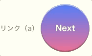
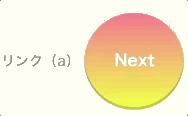
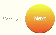
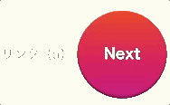
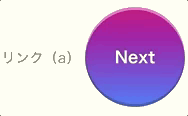
HTML
5色用意しました。
button-circle というクラスのあとに color2 〜 color5 を記述してください。
[html]
<a href=”#” class=”reset button-circle”>Next</a>
<a href=”#” class=”reset button-circle color2″>Next</a>
<a href=”#” class=”reset button-circle color3″>Next</a>
<a href=”#” class=”reset button-circle color4″>Next</a>
<a href=”#” class=”reset button-circle color5″>Next</a>
[/html]
CSS
[css]
.button-circle {
text-align: center;
box-sizing: border-box;
display: inline-block;
width: 100px;
height: 100px;
border-radius: 50%;
line-height: 100px;
color: #fff;
font-weight: bold;
background: linear-gradient(#447fff, #ff7d93);
box-shadow: inset 0 3px 0 rgba(255,255,255,0.5), inset 0 -3px 0 rgba(0,0,0,0.2);
transition: transform 0.3s;
}
.button-circle:hover {
transform: scale(-1,1);
}
.button-circle:active, .button-circle:focus {
background: linear-gradient(to top, #447fff, #ff7d93);
box-shadow: inset 0 -3px 0 rgba(255,255,255,0.5), inset 0 3px 0 rgba(0,0,0,0.2);
}
.button-circle.color2 {
background: linear-gradient(#ff7d93, #efff3d);
}
.button-circle.color2:active, .button-circle.color2:focus {
background: linear-gradient(to top, #ff7d93, #efff3d);
}
.button-circle.color3 {
background: linear-gradient(#efff3d, #ff5722);
}
.button-circle.color3:active, .button-circle.color3:focus {
background: linear-gradient(to top, #efff3d, #ff5722);
}
.button-circle.color4 {
background: linear-gradient(#ff5722, #da0080);
}
.button-circle.color4:active, .button-circle.color4:focus {
background: linear-gradient(to top, #ff5722, #da0080);
}
.button-circle.color5 {
background: linear-gradient(#da0080, #447fff);
}
.button-circle.color5:active, .button-circle.color5:focus {
background: linear-gradient(to top, #da0080, #447fff);
}
[/css]
動作サンプル
円形ボタンのサンプルです。
See the Pen css-button-circle by Beco (@becolomochi) on CodePen.
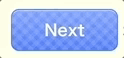
ふわふわ光るボタン

box-shadowでボタンの周りが光っているようにしました。カーソルを当てると光るスピードが速くなります。
HTML
5色用意しました。
button-glow というクラスのあとに color2 〜 color5 を追加してください。
[html]
<a href=”#” class=”reset button-glow”>Next</a><!– 青 –>
<a href=”#” class=”reset button-glow color2″>Next</a><!– 緑 –>
<a href=”#” class=”reset button-glow color3″>Next</a><!– ピンク –>
<a href=”#” class=”reset button-glow color4″>Next</a><!– オレンジ –>
<a href=”#” class=”reset button-glow color5″>Next</a><!– 赤 –>
[/html]
CSS
[css]
.button-glow {
text-align: center;
box-sizing: border-box;
display: inline-block;
border-radius: 10px;
margin: 0 10px; /* 光る部分を空けるための余白 */
padding: 0.5em 2em;
line-height: 1.5;
color: #fff;
font-weight: bold;
border: 1px solid #fff;
animation: 1s glow infinite alternate;
background: linear-gradient(#77a2ff, #447fff); /* 青 */
box-shadow: 0 0 10px 3px rgba(68, 127, 255, 0.5)
}
.button-glow:hover {
animation: 0.3s glow linear infinite alternate;
}
.button-glow:active, .button-glow:focus {
background: #447fff;
}
.button-glow.color2 {
background: linear-gradient(#82d558, #64c832); /* 緑 */
box-shadow: 0 0 10px 3px rgba(100, 200, 50, 0.5);
}
.button-glow.color2:active, .button-glow.color2:focus {
background: #64c832;
}
.button-glow.color3 {
background: linear-gradient(#ffb0bd, #ff7d93); /* ピンク */
box-shadow: 0 0 10px 3px rgba(255, 125, 147, 0.5);
}
.button-glow.color3:active, .button-glow.color3:focus {
background: #ff7d93;
}
.button-glow.color4 {
background: linear-gradient(#ff7e55, #ff5722); /* オレンジ */
box-shadow: 0 0 10px 3px rgba(255, 87, 34, 0.5);
}
.button-glow.color4:active, .button-glow.color4:focus {
background: #ff5722;
}
.button-glow.color5 {
background: linear-gradient(#ff0e9c, #da0080); /* 赤 */
box-shadow: 0 0 10px 3px rgba(218, 0, 128, 0.5);
}
.button-glow.color5:active, .button-glow.color5:focus {
background: #da0080;
}
@keyframes glow {
0% {box-shadow: none;}
}
[/css]
動作サンプル
ふわふわ光るボタンの動作サンプルです。
See the Pen css-button-glow by Beco (@becolomochi) on CodePen.
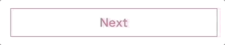
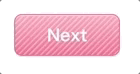
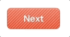
ストライプ柄のボタン
背景にストライプをつけたボタンです。
画像は使わずCSSのグラデーションでストライプを作っています。
HTML
5色用意しました。button-stripe というクラスのあとに color2 〜 color5 を追加してください。
[html]
<a href=”#” class=”reset button-stripe”>Next</a><!– 青 –>
<a href=”#” class=”reset button-stripe color2″>Next</a><!– 緑 –>
<a href=”#” class=”reset button-stripe color3″>Next</a><!– ピンク –>
<a href=”#” class=”reset button-stripe color4″>Next</a><!– オレンジ –>
<a href=”#” class=”reset button-stripe color5″>Next</a><!– 赤 –>
[/html]
CSS
[css]
.button-stripe {
text-align: center;
box-sizing: border-box;
display: inline-block;
border-radius: 8px;
padding: 0.5em 2em;
line-height: 1.5;
color: #fff;
font-weight: bold;
border: 1px solid #447fff;
background: repeating-linear-gradient(-45deg, transparent, transparent 2px, rgba(255, 255, 255, 0.5) 4px, rgba(255, 255, 255, 0.5) 4px), linear-gradient(#77a2ff, #447fff);
box-shadow: inset 0 1px 0 rgba(255,255,255,0.5);
}
.button-stripe:hover {
background: repeating-linear-gradient(-45deg, transparent, transparent 2px, rgba(255,255,255,0.3) 4px, rgba(255,255,255,0.3) 4px), linear-gradient(#77a2ff, #447fff);
}
.button-stripe:active, .button-stripe:focus {
background: #447fff;
box-shadow: inset 0 -1px 0 rgba(255,255,255,0.5);
}
.button-stripe.color2 {
border: 1px solid #64c832;
background: repeating-linear-gradient(-45deg, transparent, transparent 2px, rgba(255, 255, 255, 0.5) 4px, rgba(255, 255, 255, 0.5) 4px), linear-gradient(#82d558, #64c832);
box-shadow: inset 0 1px 0 rgba(255,255,255,0.5);
}
.button-stripe.color2:hover {
background: repeating-linear-gradient(-45deg, transparent, transparent 2px, rgba(255,255,255,0.3) 4px, rgba(255,255,255,0.3) 4px), linear-gradient(#82d558, #64c832);
}
.button-stripe.color2:active, .button-stripe.color2:focus {
background: #64c832;
box-shadow: inset 0 -1px 0 rgba(255,255,255,0.5);
}
.button-stripe.color3 {
border: 1px solid #ff7d93;
background: repeating-linear-gradient(-45deg, transparent, transparent 2px, rgba(255, 255, 255, 0.5) 4px, rgba(255, 255, 255, 0.5) 4px), linear-gradient(#ffb0bd, #ff7d93);
box-shadow: inset 0 1px 0 rgba(255,255,255,0.5);
}
.button-stripe.color3:hover {
background: repeating-linear-gradient(-45deg, transparent, transparent 2px, rgba(255,255,255,0.3) 4px, rgba(255,255,255,0.3) 4px), linear-gradient(#ffb0bd, #ff7d93);
}
.button-stripe.color3:active, .button-stripe.color3:focus {
background: #ff7d93;
box-shadow: inset 0 -1px 0 rgba(255,255,255,0.5);
}
.button-stripe.color4 {
border: 1px solid #ff5722;
background: repeating-linear-gradient(-45deg, transparent, transparent 2px, rgba(255, 255, 255, 0.5) 4px, rgba(255, 255, 255, 0.5) 4px), linear-gradient(#ff7e55, #ff5722);
box-shadow: inset 0 1px 0 rgba(255,255,255,0.5);
}
.button-stripe.color4:hover {
background: repeating-linear-gradient(-45deg, transparent, transparent 2px, rgba(255,255,255,0.3) 4px, rgba(255,255,255,0.3) 4px), linear-gradient(#ff7e55, #ff5722);
}
.button-stripe.color4:active, .button-stripe.color4:focus {
background: #ff5722;
box-shadow: inset 0 -1px 0 rgba(255,255,255,0.5);
}
.button-stripe.color5 {
border: 1px solid #da0080;
background: repeating-linear-gradient(-45deg, transparent, transparent 2px, rgba(255, 255, 255, 0.5) 4px, rgba(255, 255, 255, 0.5) 4px), linear-gradient(#ff0e9c, #da0080);
box-shadow: inset 0 1px 0 rgba(255,255,255,0.5);
}
.button-stripe.color5:hover {
background: repeating-linear-gradient(-45deg, transparent, transparent 2px, rgba(255,255,255,0.3) 4px, rgba(255,255,255,0.3) 4px), linear-gradient(#ff0e9c, #da0080);
}
.button-stripe.color5:active, .button-stripe.color5:focus {
background: #da0080;
box-shadow: inset 0 -1px 0 rgba(255,255,255,0.5);
}
[/css]
動作サンプル
ストライプ柄ボタンの動作サンプルです。
See the Pen css-button-stripe by Beco (@becolomochi) on CodePen.
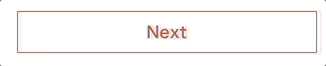
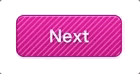
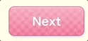
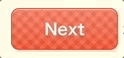
ギンガムチェック風ボタン
上のストライプのボタンにグラデーションを増やすとギンガムチェック風になりました。
こちらも画像は使用していません。
HTML
5色あります。
button-check というクラスのあとに color2 〜 color5 を追加してください。
[html]
<a href=”#” class=”reset button-check”>Next</a><!– 青 –>
<a href=”#” class=”reset button-check color2″>Next</a><!– 緑 –>
<a href=”#” class=”reset button-check color3″>Next</a><!– ピンク –>
<a href=”#” class=”reset button-check color4″>Next</a><!– オレンジ –>
<a href=”#” class=”reset button-check color5″>Next</a><!– 赤 –>
[/html]
CSS
[css]
.button-check {
text-align: center;
box-sizing: border-box;
display: inline-block;
border-radius: 8px;
padding: 0.5em 2em;
line-height: 1.5;
color: #fff;
font-weight: bold;
border: 1px solid #447fff;
background: repeating-linear-gradient(-45deg, transparent, transparent 4px, rgba(255,255,255,0.1) 4px, rgba(255,255,255,0.1) 8px), repeating-linear-gradient(45deg, transparent, transparent 4px, rgba(255,255,255,0.1) 4px, rgba(255,255,255,0.1) 8px), linear-gradient(#77a2ff, #447fff);
box-shadow: inset 0 1px 0 rgba(255,255,255,0.5);
}
.button-check:hover {
background: repeating-linear-gradient(-45deg, transparent, transparent 4px, rgba(255,255,255,0.2) 4px, rgba(255,255,255,0.2) 8px), repeating-linear-gradient(45deg, transparent, transparent 4px, rgba(255,255,255,0.2) 4px, rgba(255,255,255,0.2) 8px), linear-gradient(#77a2ff, #447fff);
}
.button-check:active, .button-check:focus {
background: #447fff;
box-shadow: inset 0 -1px 0 rgba(255,255,255,0.5);
}
.button-check.color2 {
border: 1px solid #64c832;
background: repeating-linear-gradient(-45deg, transparent, transparent 4px, rgba(255,255,255,0.1) 4px, rgba(255,255,255,0.1) 8px), repeating-linear-gradient(45deg, transparent, transparent 4px, rgba(255,255,255,0.1) 4px, rgba(255,255,255,0.1) 8px), linear-gradient(#82d558, #64c832);
box-shadow: inset 0 1px 0 rgba(255,255,255,0.5);
}
.button-check.color2:hover {
background: repeating-linear-gradient(-45deg, transparent, transparent 4px, rgba(255,255,255,0.2) 4px, rgba(255,255,255,0.2) 8px), repeating-linear-gradient(45deg, transparent, transparent 4px, rgba(255,255,255,0.2) 4px, rgba(255,255,255,0.2) 8px), linear-gradient(#82d558, #64c832);
}
.button-check.color2:active, .button-check.color2:focus {
background: #64c832;
box-shadow: inset 0 -1px 0 rgba(255,255,255,0.5);
}
.button-check.color3 {
border: 1px solid #ff7d93;
background: repeating-linear-gradient(-45deg, transparent, transparent 4px, rgba(255,255,255,0.1) 4px, rgba(255,255,255,0.1) 8px), repeating-linear-gradient(45deg, transparent, transparent 4px, rgba(255,255,255,0.1) 4px, rgba(255,255,255,0.1) 8px), linear-gradient(#ffb0bd, #ff7d93);
box-shadow: inset 0 1px 0 rgba(255,255,255,0.5);
}
.button-check.color3:hover {
background: repeating-linear-gradient(-45deg, transparent, transparent 4px, rgba(255,255,255,0.2) 4px, rgba(255,255,255,0.2) 8px), repeating-linear-gradient(45deg, transparent, transparent 4px, rgba(255,255,255,0.2) 4px, rgba(255,255,255,0.2) 8px), linear-gradient(#ffb0bd, #ff7d93);
}
.button-check.color3:active, .button-check.color3:focus {
background: #ff7d93;
box-shadow: inset 0 -1px 0 rgba(255,255,255,0.5);
}
.button-check.color4 {
border: 1px solid #ff5722;
background: repeating-linear-gradient(-45deg, transparent, transparent 4px, rgba(255,255,255,0.1) 4px, rgba(255,255,255,0.1) 8px), repeating-linear-gradient(45deg, transparent, transparent 4px, rgba(255,255,255,0.1) 4px, rgba(255,255,255,0.1) 8px), linear-gradient(#ff7e55, #ff5722);
box-shadow: inset 0 1px 0 rgba(255,255,255,0.5);
}
.button-check.color4:hover {
background: repeating-linear-gradient(-45deg, transparent, transparent 4px, rgba(255,255,255,0.2) 4px, rgba(255,255,255,0.2) 8px), repeating-linear-gradient(45deg, transparent, transparent 4px, rgba(255,255,255,0.2) 4px, rgba(255,255,255,0.2) 8px), linear-gradient(#ff7e55, #ff5722);
}
.button-check.color4:active, .button-check.color4:focus {
background: #ff5722;
box-shadow: inset 0 -1px 0 rgba(255,255,255,0.5);
}
.button-check.color5 {
border: 1px solid #da0080;
background: repeating-linear-gradient(-45deg, transparent, transparent 4px, rgba(255,255,255,0.1) 4px, rgba(255,255,255,0.1) 8px), repeating-linear-gradient(45deg, transparent, transparent 4px, rgba(255,255,255,0.1) 4px, rgba(255,255,255,0.1) 8px), linear-gradient(#ff0e9c, #da0080);
box-shadow: inset 0 1px 0 rgba(255,255,255,0.5);
}
.button-check.color5:hover {
background: repeating-linear-gradient(-45deg, transparent, transparent 4px, rgba(255,255,255,0.2) 4px, rgba(255,255,255,0.2) 8px), repeating-linear-gradient(45deg, transparent, transparent 4px, rgba(255,255,255,0.2) 4px, rgba(255,255,255,0.2) 8px), linear-gradient(#ff0e9c, #da0080);
}
.button-check.color5:active, .button-check.color5:focus {
background: #da0080;
box-shadow: inset 0 -1px 0 rgba(255,255,255,0.5);
}
[/css]
動作サンプル
ギンガムチェック風ボタンの動作サンプルです。
See the Pen css-button-check by Beco (@becolomochi) on CodePen.
スマホ対応させる方法
iOSでタップ時に表示される半透明の黒地を消したい
-webkit-ta-highlight-color の設定を reset クラスなどに追加しておきます。
CSS
[css]
.reset {
color: black;
text-decoration: none;
font-family: sans-serif;
font-weight: normal;
font-size: 16px;
line-height: 1.5;
letter-spacing: normal;
border: none;
background: transparent;
margin: 0;
padding: 0;
outline: none;
cursor: pointer;
-webkit-ta-highlight-color: rgba(0,0,0,0); /* iOSタップ時の強調色を透明に */
}
[/css]
hoverやactiveなどを実行できるようにしたい
body 要素または親の要素に ontouchstart=”” を追加するだけでOKです。
HTML
[html]
<body ontouchstart=””>
[/html]
または、
[html]
<div class=”wrapper” ontouchstart=””><!– コンテンツ部分を囲む要素 –>
[/html]
まとめ
時間のかかりがちなボタンデザインがコピペで済めば、かかるはずだった時間はコンテンツ制作へ時間を当てられますね。この記事があなたのサイト運営に役立てられれば幸いです。